La Zambra
2022
2022
Identity and brand roll-out for a 5-star hotel in Andalusia.
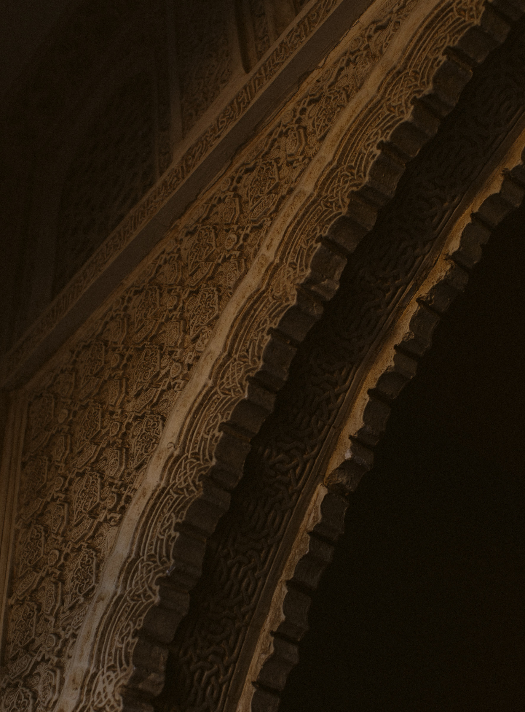
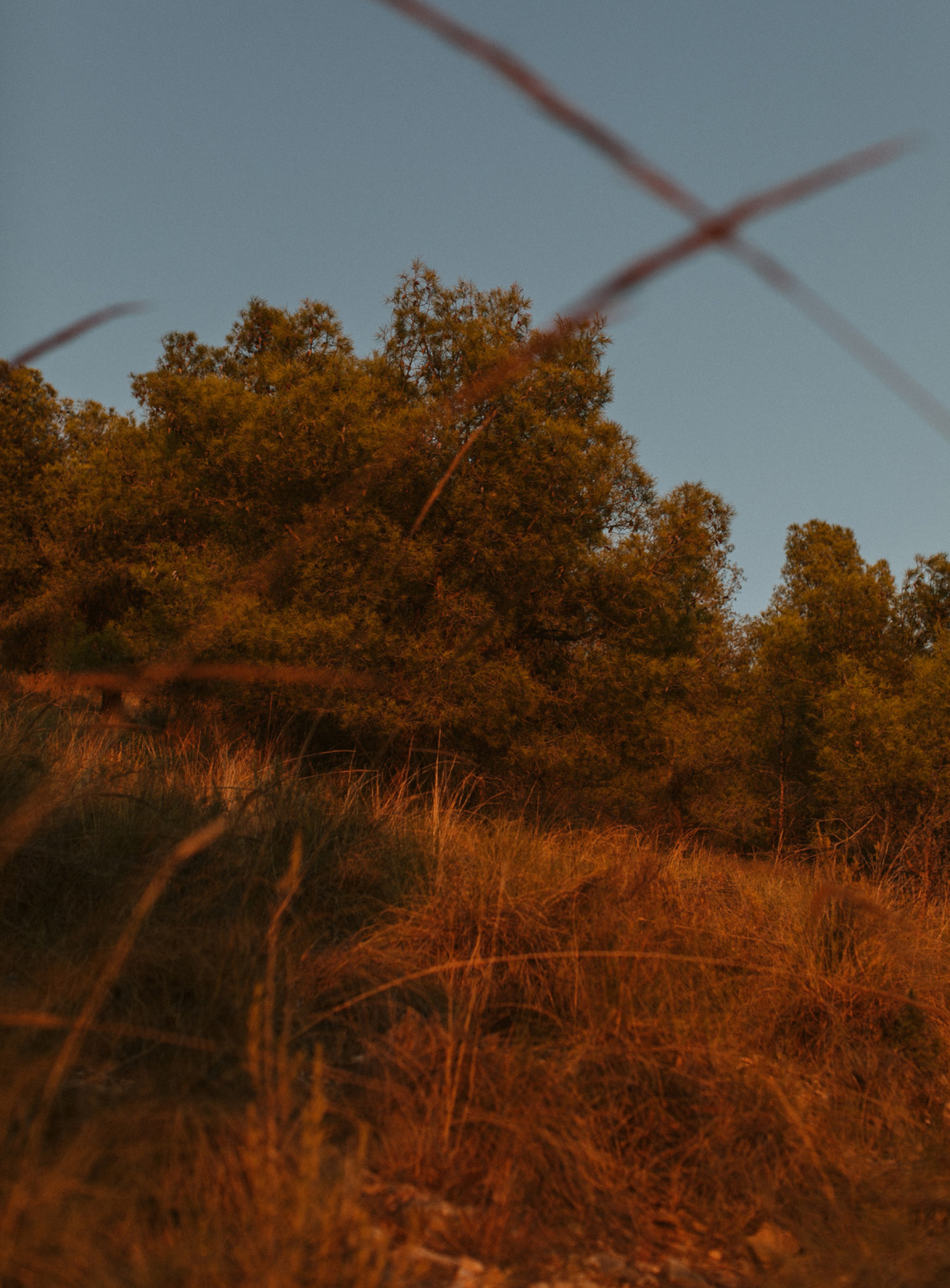
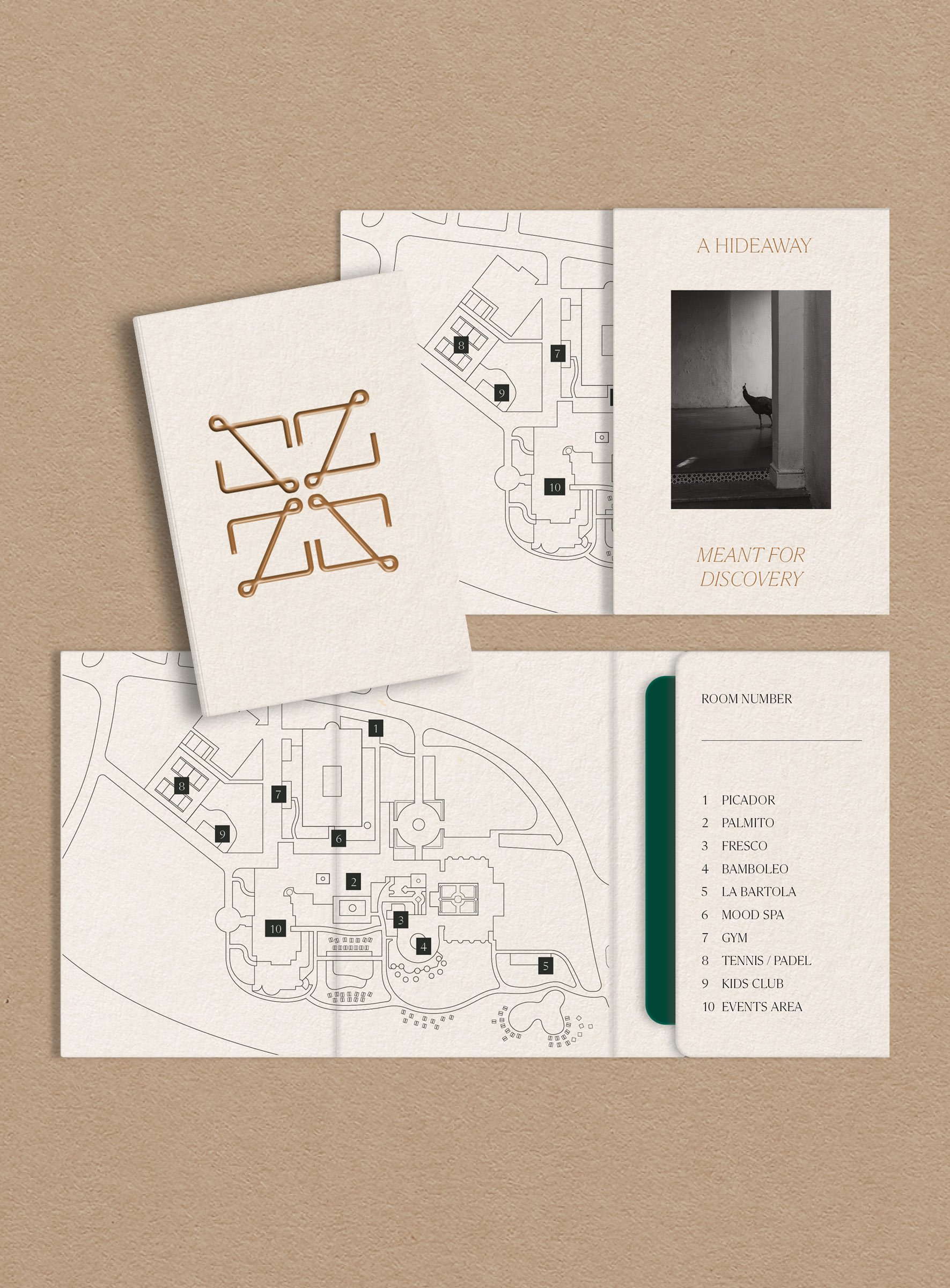
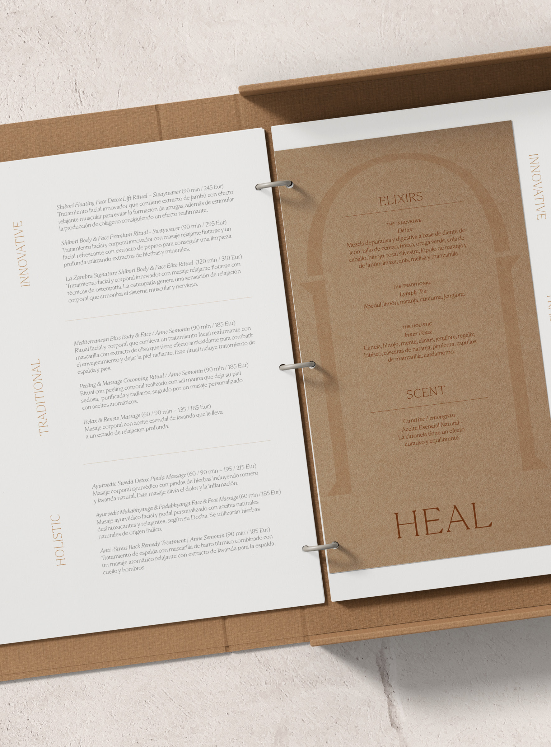
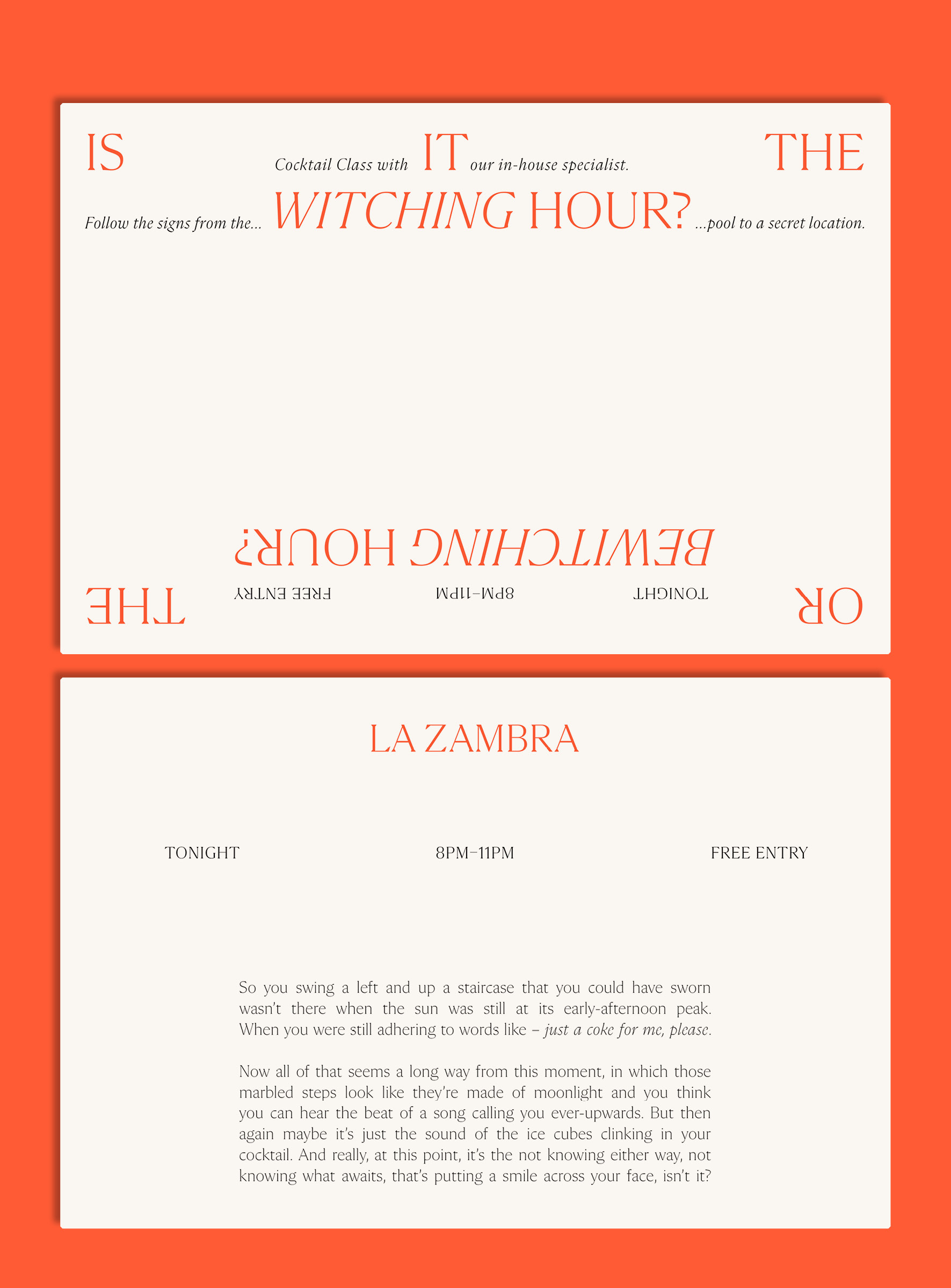
Name and logo derive from the Zambra – a specific type of flamenco dance typical for the region. The brand’s monogram can be multiplied into a pattern, hinting at the Moorish influence on the local architecture. The overall brand was designed to adapt to both the quiet, earthbound side of the hotel's daytime experience and the vivid, hedonistic aspect of the hotel's nightlife.
Name and logo derive from the Zambra – a specific type of flamenco dance typical for the region. The brand’s monogram can be multiplied into a pattern, hinting at the Moorish influence on the local architecture. The overall brand was designed to adapt to both the quiet, earthbound side of the hotel's daytime experience and the vivid, hedonistic aspect of the hotel's nightlife.
Filed under:
Branding, Hospitality, Graphic Design
With:
01–20
Copywriting:
James Darton
Photography:
Dos Más En La Mesa
Branding, Hospitality, Graphic Design
With:
01–20
Copywriting:
James Darton
Photography:
Dos Más En La Mesa






Ercilla de Bilbao
2021
2021
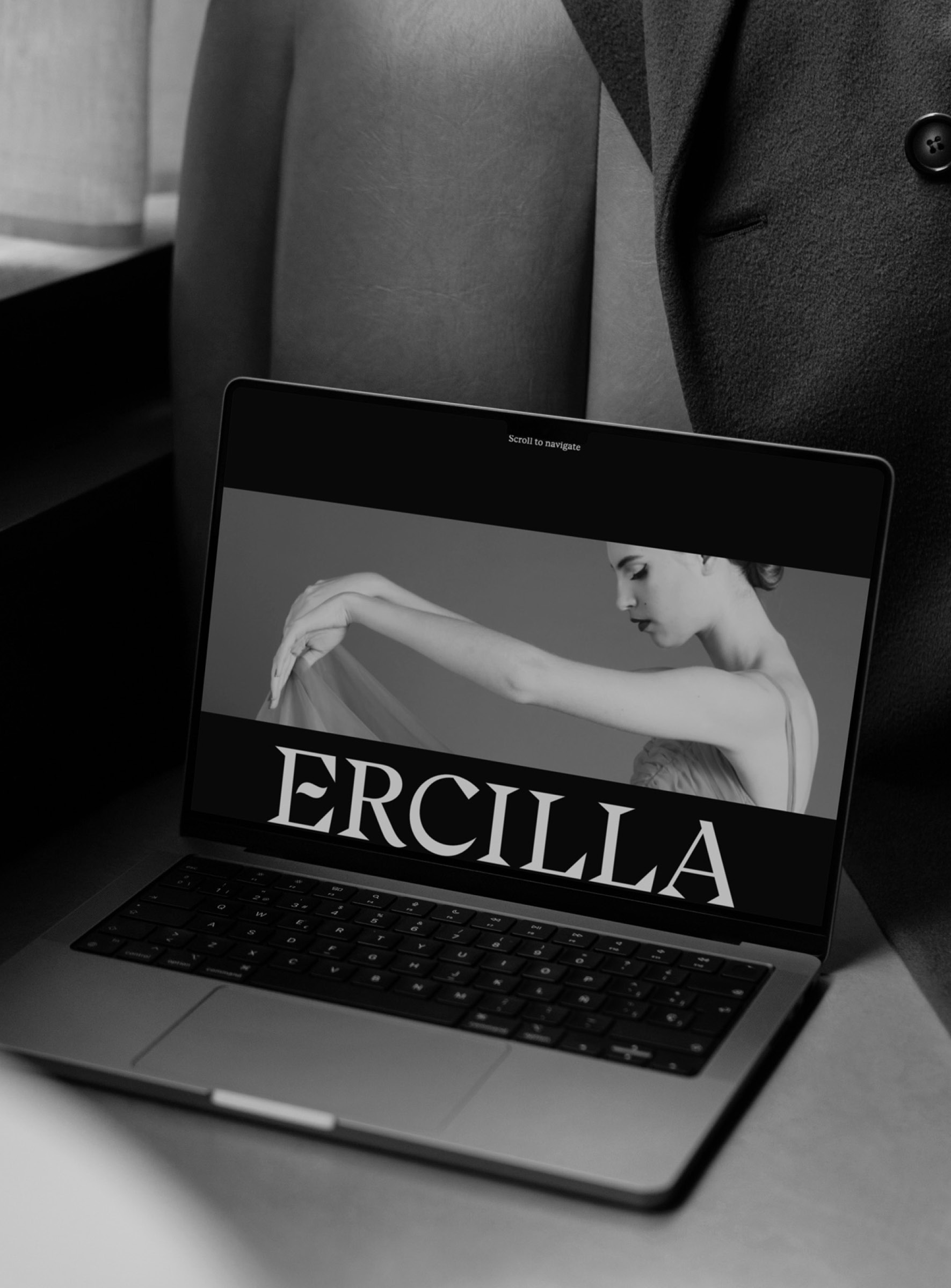
Rebrand of the hotel Ercilla de Bilbao.
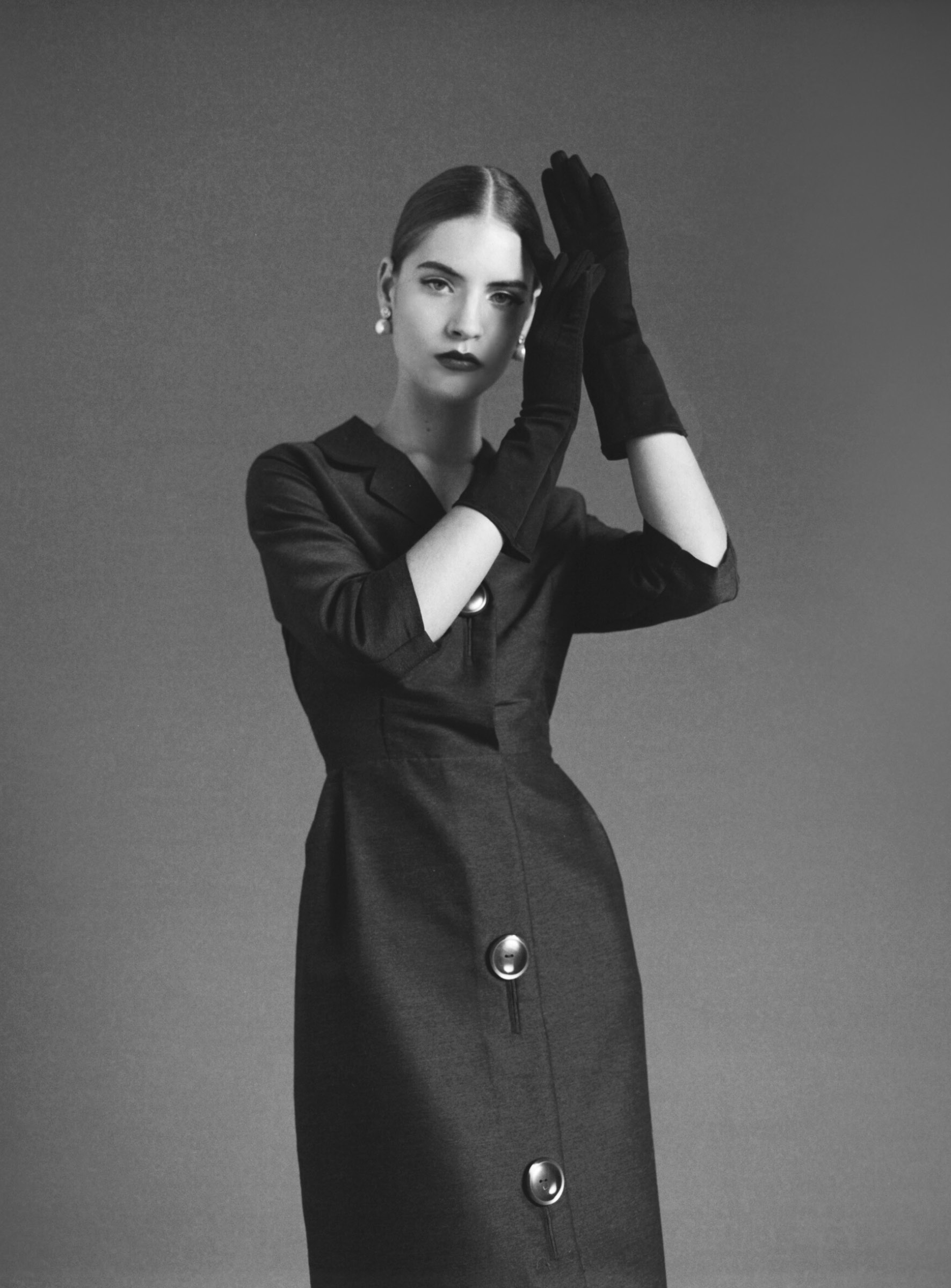
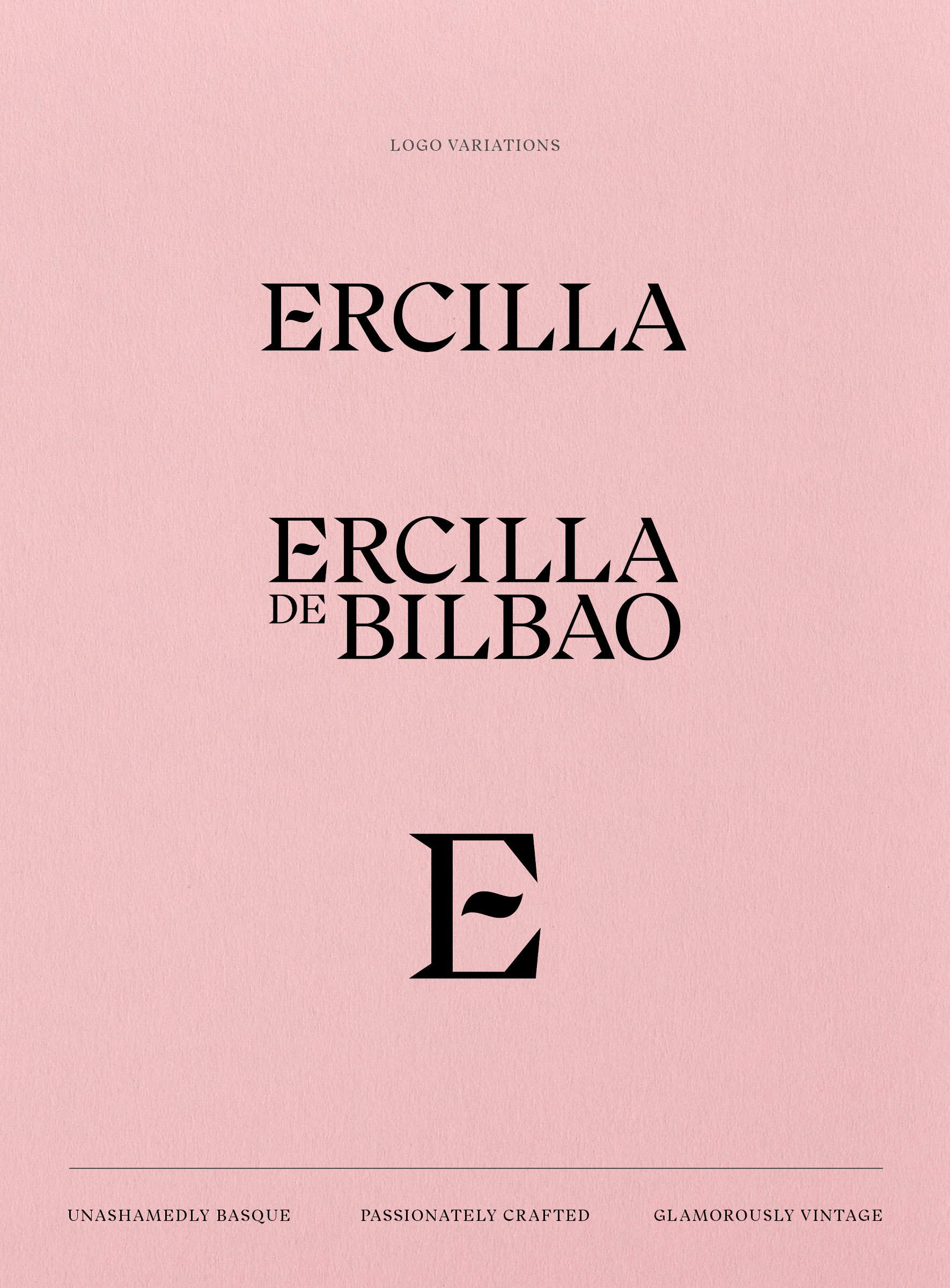
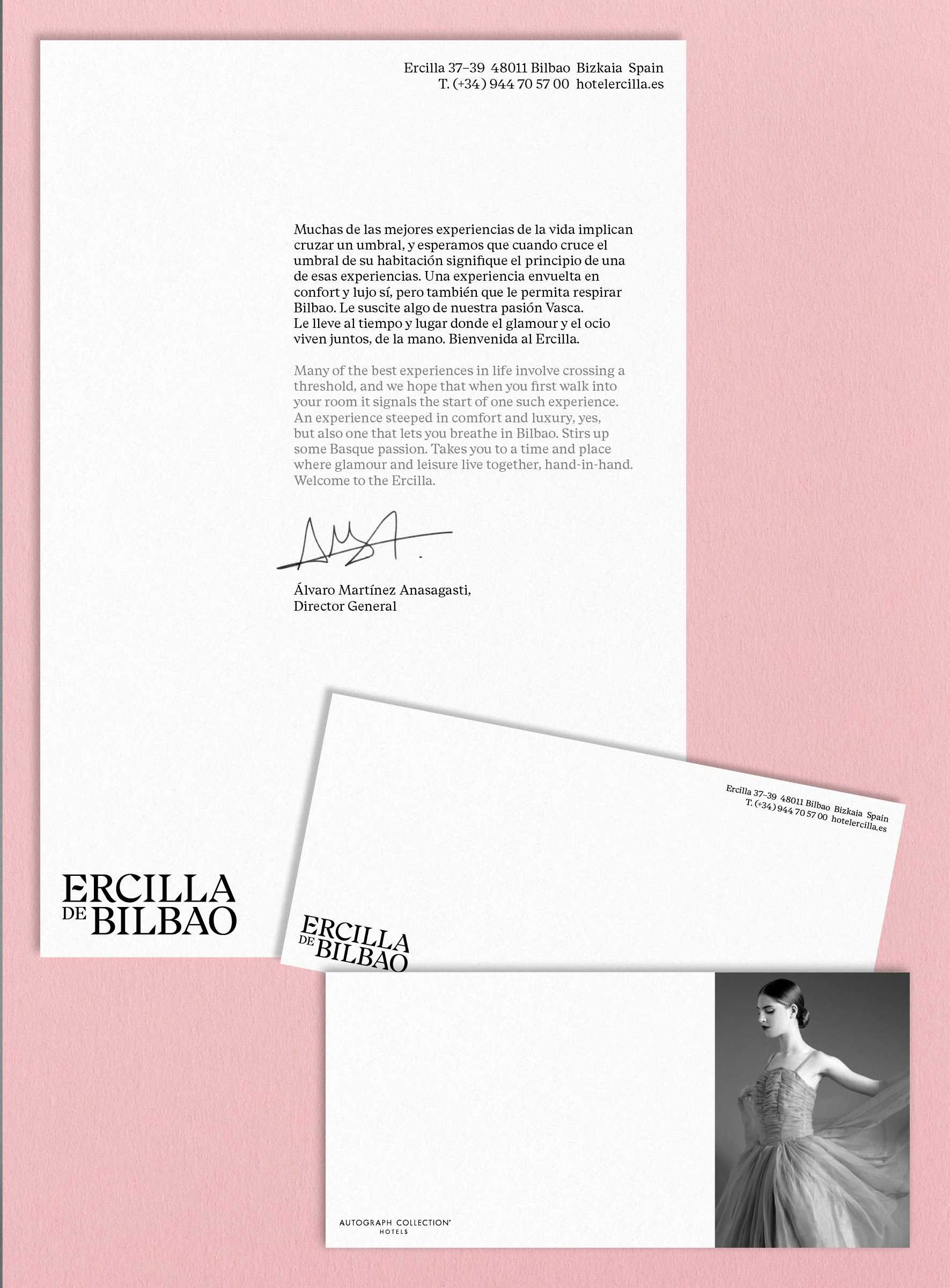
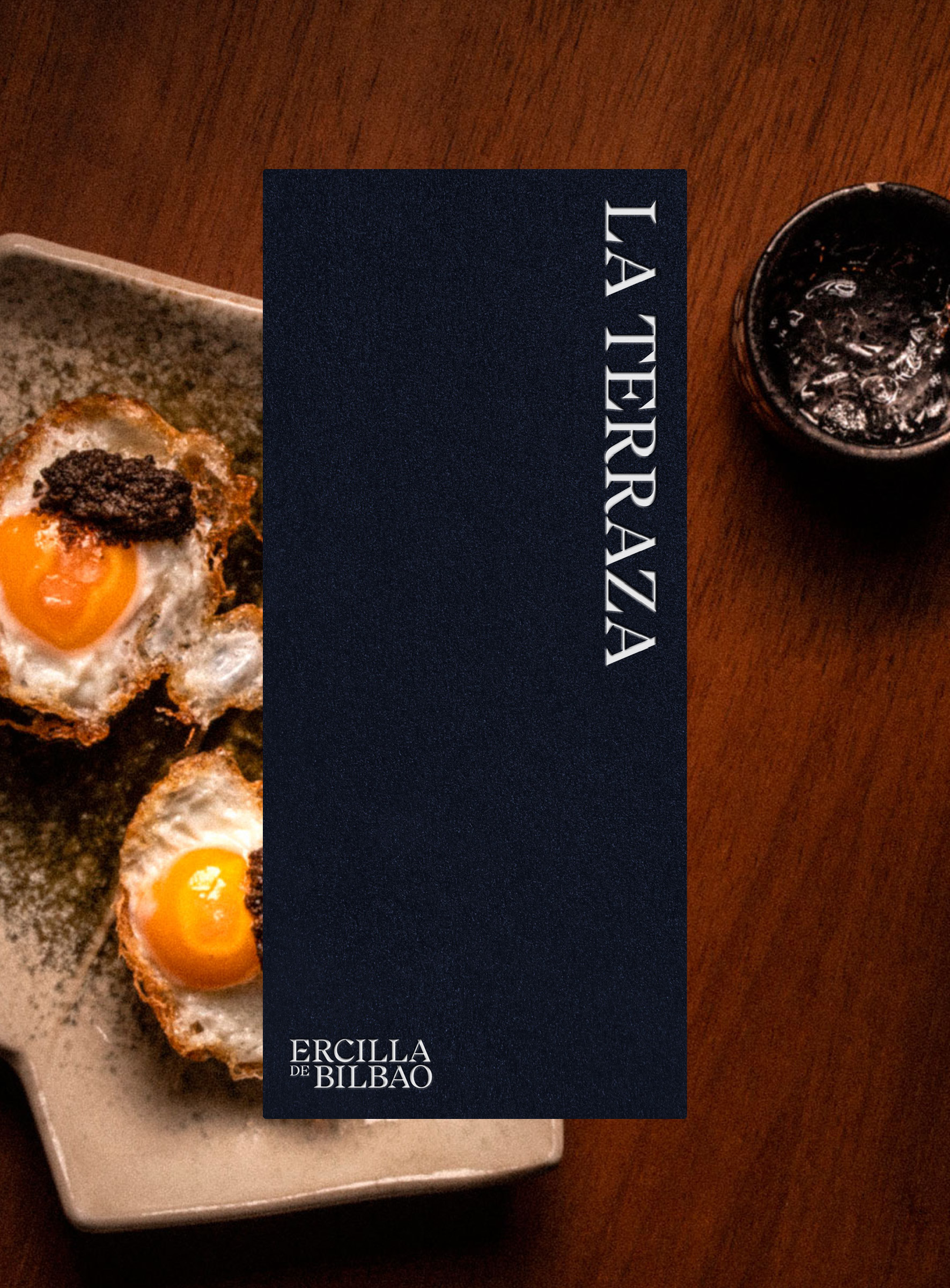
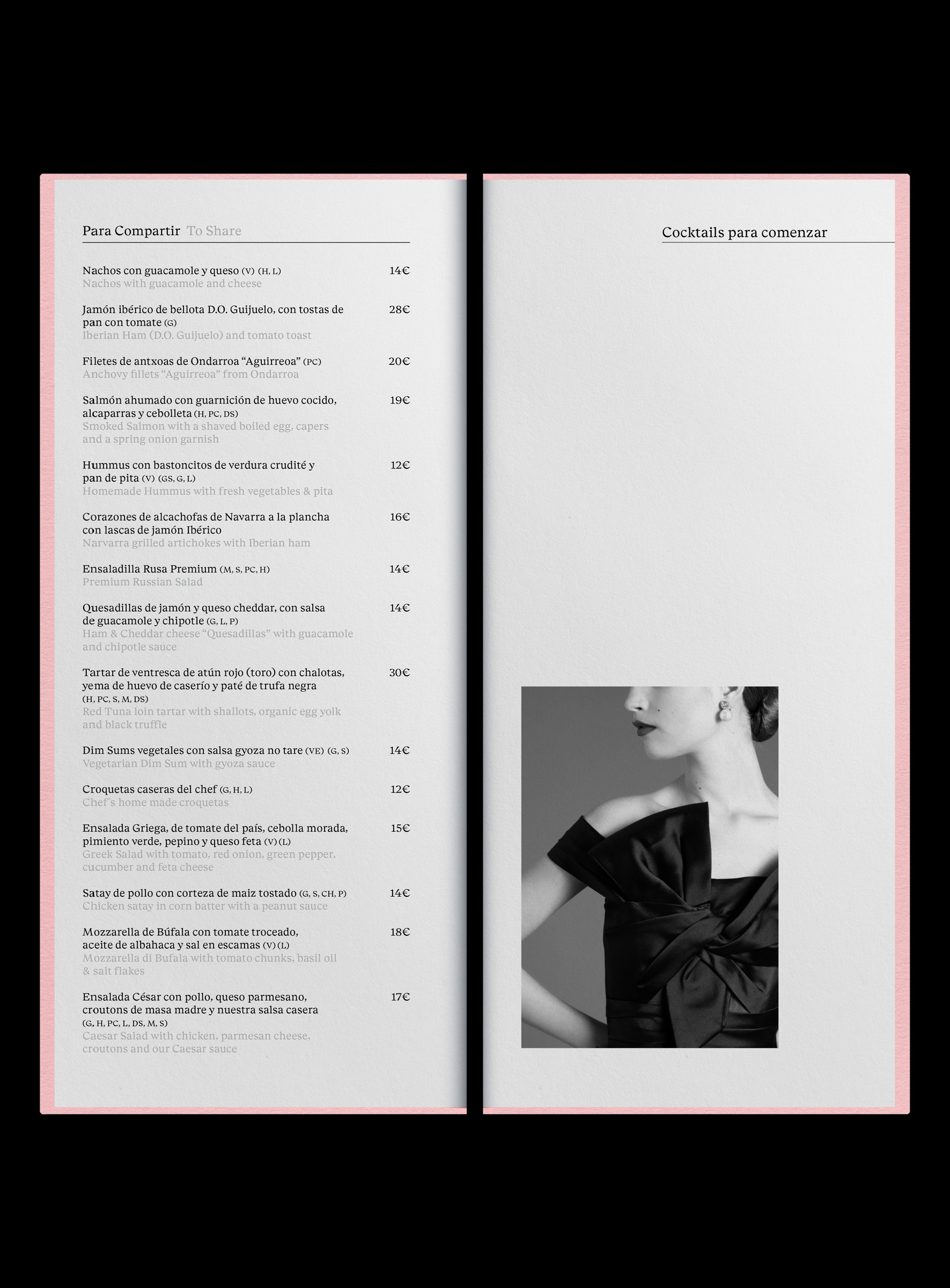
The new hotel identity combines Basque personality with vintage glamour through the use of expressive typography, a rich colour palette, copywriting focus on the Basque language and a vintage-fashion photoshoot.
The hotel’s extensive image archive was included in the applications alongside bilingual captions, keeping alive the illustrious guests that had frequented the Ercilla in the past — from bullfighters and actresses to the legendary Luciano Pavarotti.
Filed under:
Branding, Hospitality, Graphic Design
With:
01–20
Lead Design:
Fraser Bingham
Photography:
Mafalda Silva
Branding, Hospitality, Graphic Design
With:
01–20
Lead Design:
Fraser Bingham
Photography:
Mafalda Silva






Läila
2022
2022
Branding and Art Direction for a family-run hotel in the Seychelles.
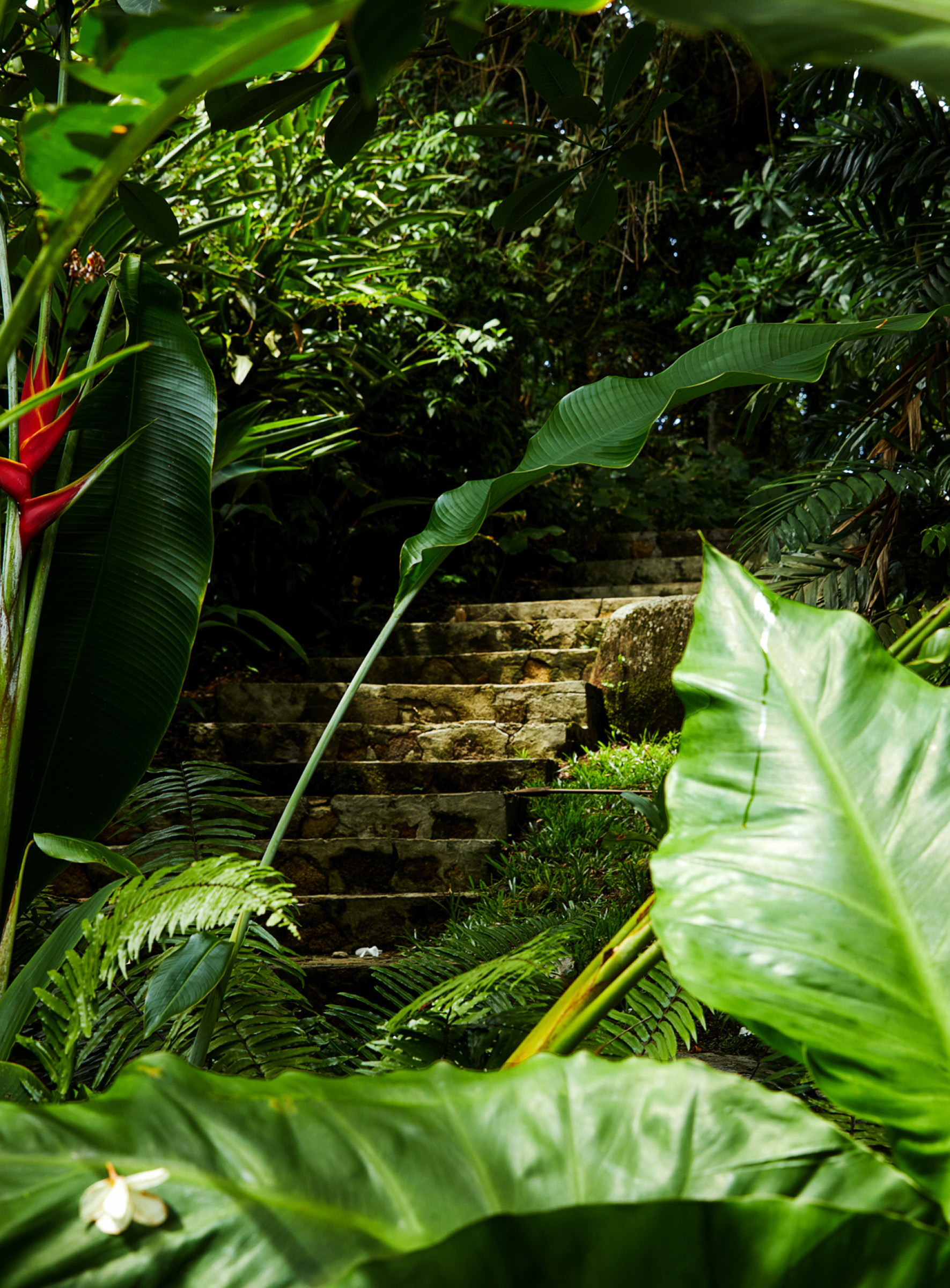
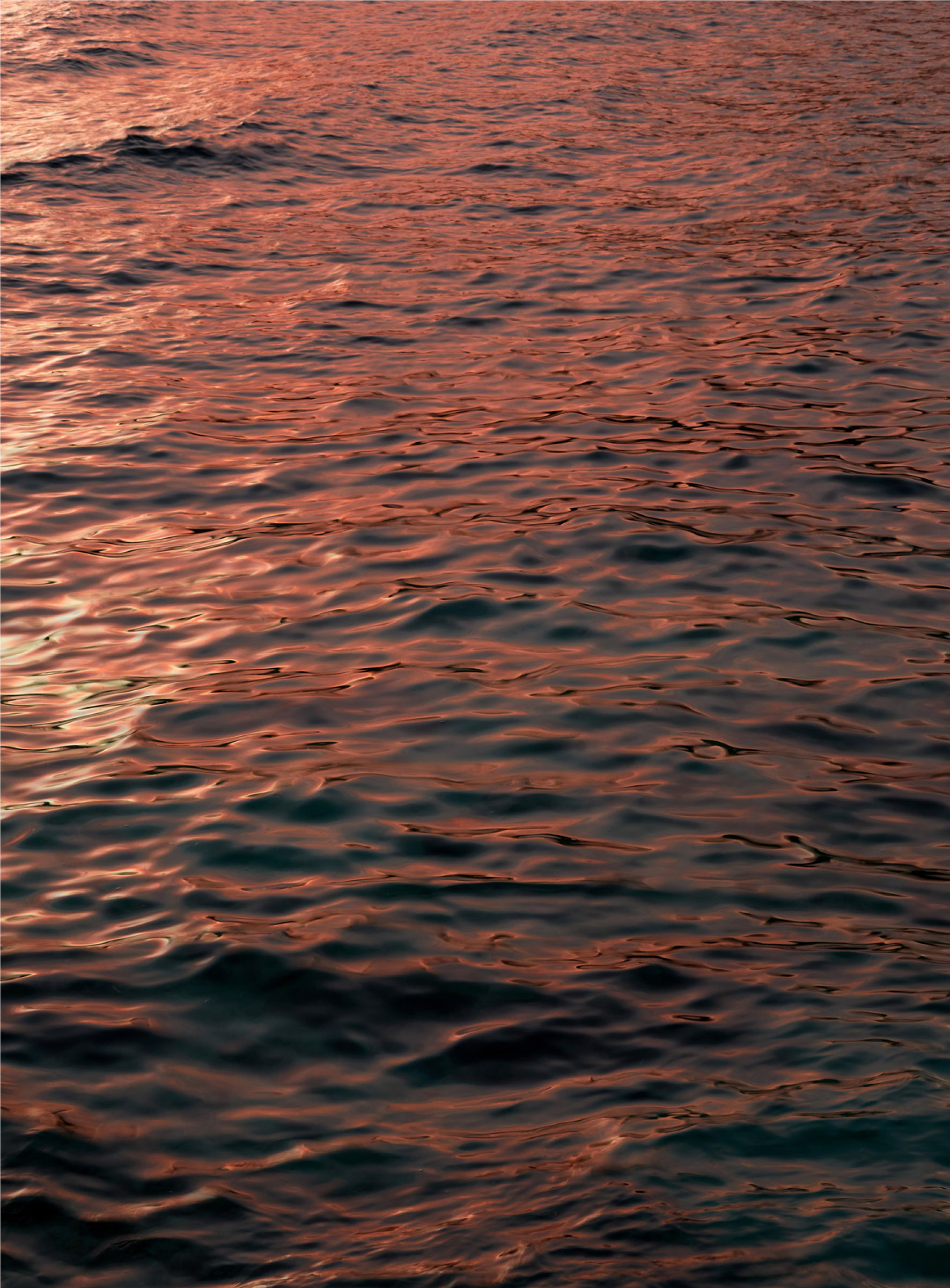
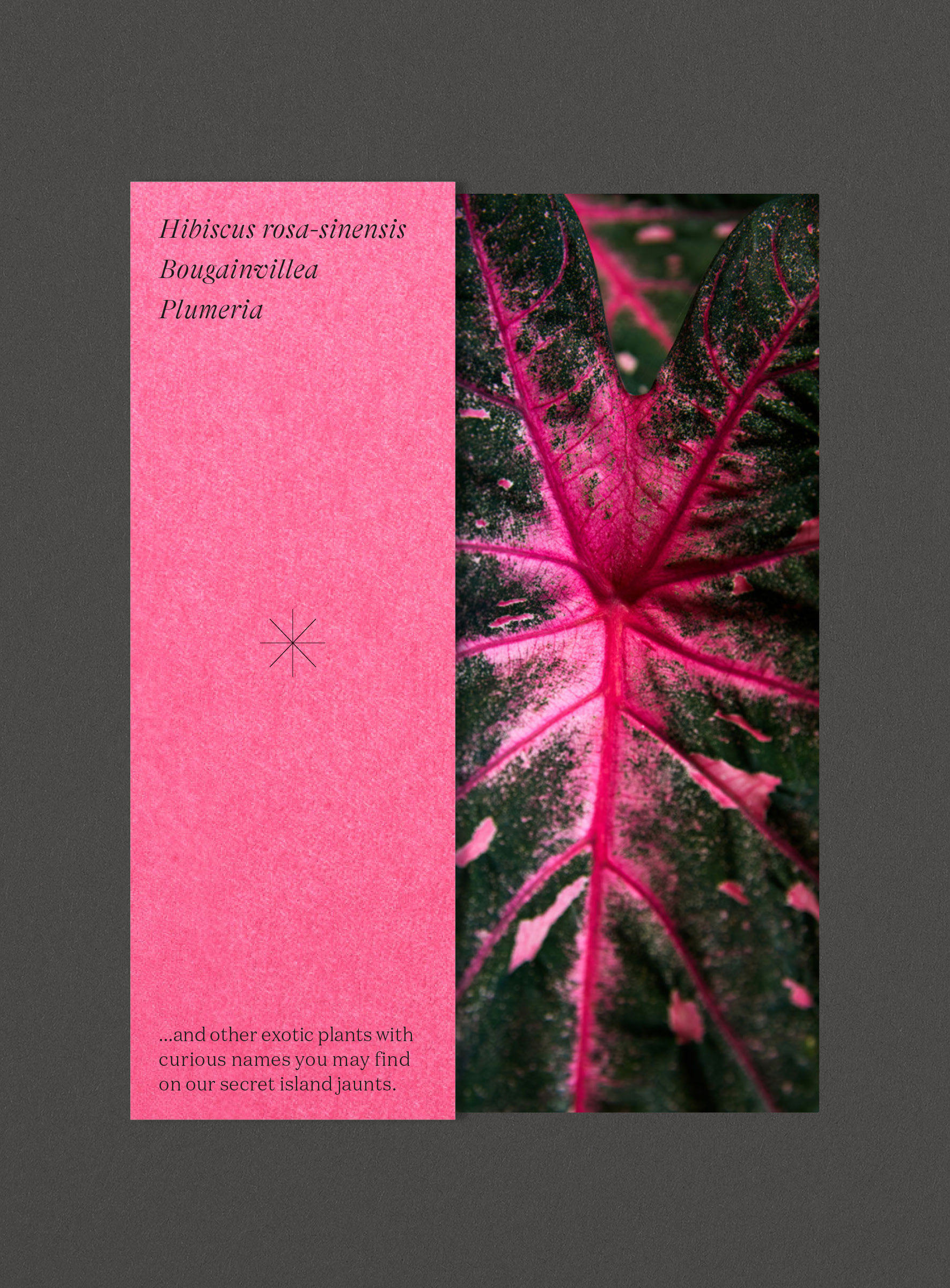
The Creole term Laïla stands for an appreciation of what is around oneself. The brand was built on the idea that luxury is to be in touch with one's social and natural surroundings and referred to specifics of the islands and the hotel’s location.
During a 5-day shoot that I styled and directed, Mafalda Silva and I documented the Seychelles outside the luxury resorts covering local flora and fauna, people, landscapes, and activities.
Filed under:
Branding, Hospitality, Art Direction
With:
01–20
Copywriting:
James Darton
Photography:
Mafalda Silva
Branding, Hospitality, Art Direction
With:
01–20
Copywriting:
James Darton
Photography:
Mafalda Silva
